Planning The Content Of The Film Review

After beginning to create the layout of my film review, I then went on to planning the most important part of the film review section itself. I have read many film reviews myself written by professional film review critics/companies such as EMPIRE magazine and have done additional research into what should be included into a film review in order to make my own film review for my short film as professional and realistic as possible. I found that when reading other film reviews that complex and very detailed analysis of the film was common therefore I was going to have to try and replicate this sort of layout for my own production.

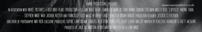
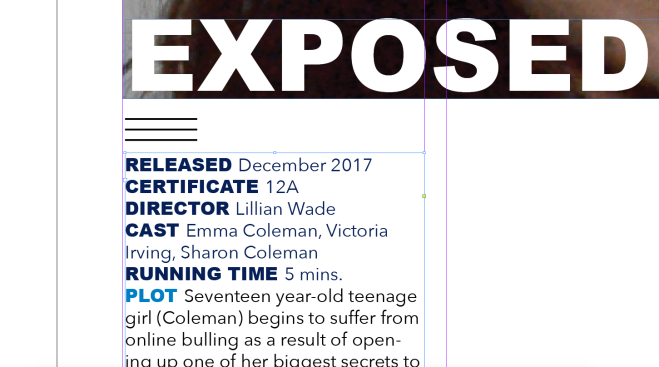
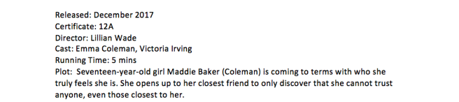
The first section that you read in a film review is the section that includes all of the key information about the film from the cast to the release date and the plot of the film. This in my opinion was the easiest part of planning the film review as the majority of the information that was included was just basic facts about the film that didn’t involve much thought.

Screen Shot 2017-12-27 at 20.17.20

The most important part of the film review is what follows after the block of information at the beginning. I found the main content of the film review very difficult to write and get right and it took many attempts for me to get a piece of writing that I was satisfied with. To help me write the review I looked into what other reviews had included in them, for example; extending on the plot overview, narrative and lead actors, media specifics such as cinematograph, mise-en-scene and narrative structure and finally the overall personal opinions on the production whether they be positive or negative.

Screen Shot 2017-12-27 at 20.19.20

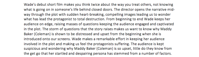
My first main paragraph that I drafted out included details such the enigma codes that the production raises to the audience and the context behind the piece of work. I go into some detail about the narrative structure as I felt like as being the director and also writing the film review I had to try and justify some reasons as to why the director may have chosen to open up the narrative with the storyline mid-way through. This section of the film review mainly revolves around the audience thoughts and feelings that the production makes them feel and why the events in the storyline occur as they do.

Screen Shot 2017-12-27 at 20.19.34

This section of my film review included views on the directors’ cinematography. Here I chose to speak about previous works such as my AS opening sequence and link that the success of the camera angles and shot types had towards conveying a certain message and how this was reinforced in the short film production as well. I also spoke briefly about the soundtrack that accompanied the visuals which I also gave my view on how successfully or unsuccessfully they worked together.


Editing Of Film Poster: Two

The final day of editing for my film poster consisted on make the changes that my peers had suggested and that I agreed with them on. The first change I made with in regards to the reviews that I chose to use on my film poster. Originally I had only chosen to use one review as well as giving it a 4 star rating from the same critics, however I realised that a review is either a star rating or a quote from whoever reviewed it, therefore I adjusted it so I had two separate reviews, one being a star rating from ‘Total Film‘ and the other being a quoted review from ‘EMPIRE magazine‘. I had to find the correct stars that looked right for the star rating review which involved me going onto Microsoft powerpoint and copying and pasting a star from there. From there on I chose to give my short a 4 star rating as I thought it was reasonable and realistic and then had the task of getting the stars the correct distance apart from each other.

After completing the review section of the film poster, I then went on to focus on the ‘coming soon‘ text and the billing block. I re-sized the billing blocks several times to see what would look best as I didn’t know what it would look like if it was smaller or bigger but I found that having it in-between small and really big worked best because it stood out but didn’t draw any attention away from the main image or the title of the film.

Screen Shot 2018-01-07 at 19.23.42

I then was faced with the decision of whether I should feature the text ‘coming soon‘ or the date as – ‘22.12.17‘ (for example) so experimented with both and asked my peers around me what they liked best. I found that in the end my peers mostly agreed on having a preference for the ‘coming soon‘ with my particular poster and I did agree with them on that so I kept it the way it was.

The final touches that I made to my film poster was slightly adjusting the colour of the text above the name of the short film and also adding a tagline as I felt this was necessary. I changed the colour of the text above the film title to a slightly more teal blue as opposed to a more red toned blue as I had previously used as I liked the appearance of this more. As well as this I also made small adjustments to what the text read going from ‘A LILLIAN WADE SHORT‘ to ‘A LILLIAN WADE SHORT FILM‘ as I preferred the appearance of it this way. I then decided that a good film poster nearly always has a tagline so I tried to come up with a good enough one for my own production. I liked the way the tagline fitted in with the text above the name of the film and the short film name as it appeared to all fit like a puzzle and I found it aesthetically pleasing to look at.

Screen Shot 2017-12-15 at 17.16.39

Short Film Review Editing: Day One

Today I began the editing process of my short film review. The software that I will be using to create my film review is a programme called ‘indesign‘. This programme is very similar to photoshop but not being very experienced with photoshop and never having used indesign before made the beginning of my film review creation quite slow.

The first decision that I made in regards to the layout of the film review. In the Empire magazines there are two different layouts of their film reviews; one is a more dated layout and the other is newer and up to date. At the moment I have decided to go with the older layout of their film review as I prefer the blue colour scheme compared with the new bright yellow one featured on their new layout.

The main image that I have currently chosen to use for the film review is not necessarily the one that I will use for the final product. I feel like there is a much better image that I can use for the film review however I need to go through my shots in my short film and find the appropriate one and then replace it. After inserting the main image I went on to focusing on the title of the film and the key information that is displayed at the very beginning of the review. I tried my best to find the most similar font for the title that is used in the Empire film reviews but couldn’t find the exact same one so I went for ‘aeriel black‘ which was the most similar font that I could find.

I have written out the key information that didn’t need any inital planning for it such as the release date, certificate of the film and the actors featured in the production. I have written some content under the heading of ‘plot‘ for the time being, however I will plan what is to be written under this heading when I plan the rest of the review out as I think this section does need to be in more detail than it currently is.

Screen Shot 2017-12-11 at 11.47.00


Editing Of Film Poster

The first decision that I had to make in regards to my film poster was the image that I was going to use. So after reviewing my audience feedback I decided that I wanted to use a close up of the protagonist for the main image of my film poster. I took my actor to the photograph studio and took a few shots with her to get some ideas of framing etc and whether I wanted the image to be portrait or landscape. I found after 10 minutes of shooting that portrait wasn’t really working for me and giving me the image I wanted for my poster so I then tried to shoot landscape which in my opinion worked a lot better and left me with images that I was much happier to use for my poster.

Portrait shots:

Landscape shots:

After I finished shooting for the main image, I took my time to look through every image I took and choose the one I liked the best and worked best for a film poster. When I had decided which image I liked the best, I then played around with filters on it to see if b&w would work better than the image being in colour and I found that I much preferred the appearance of the image in black and white than I did in colour.

 I then went on to adding the basic conventions of a film poster such as the title, main actors, billing block and reviews. After I had the basics on the poster I then started to play around with different positioning and layouts to see what worked best for the image I had chosen. I opted to just use a standard basic font as I liked the way that it appeared on the film poster, I also made the decision to keep a running theme of everything being in lower case because I really liked the way that it looked and thought it worked well too. However I did decide to make the ‘A LILLIAN WADE SHORT FILM‘ all in capital letters because I wanted that to stand out but as well I liked the contrast between all of the lowercase lettering and then the one line of uppercase lettering that made it clear who the creator of the short is. I chose to make this section of writing in a teal blue colour as I feel like it linked well with the genre due to the colour blue having connotations of coldness and sadness. As well as doing all of this, I also added a review of the film from a well-known film review magazine ‘EMPIRE‘ which feeds into the conventions of a film poster making it more realistic and professional.

The final few additions that I made during this process of making the film poster were the billing block and adding the actors names. Again, I kept the names of the actors in lowercase lettering (although be grammatically incorrect) as I wanted to keep the theme constant throughout the poster and with only having two actors present in my production meant that it was easy for me to fit their names onto the poster at the top where it worked well with the rest of the proportions of the image and other writing present on the poster.

Screen Shot 2018-01-07 at 22.15.35

Finally, I created a billing block which involved me going onto google to look at examples of other films’ billing blocks in order to create my own. The process of making the billing block took longer than I had expected it to as I had to get the proportions right with all to the writing and make sure it fitted nicely onto the poster. After typing up the billing block and editing it, I then positioned it at the bottom of the poster as this is the most common place for billing blocks to be located and because this is where it fit and looked best.

Screen Shot 2018-01-07 at 22.37.15Screen Shot 2018-01-07 at 22.15.28

The Filming Process – 08/12/17

Today was the final day of the filming process for my short film. I decided to re-film some of the shot sequences that I had previously filmed due to not being happy with the outcome of the footage.

I planned out everything that I was going to do on this day prior to filming so that it would hopefully run smoothly. Unfortunately, I was unable to get everything filmed that I had planned at wanted to due to the camera battery dying unexpectedly and my actors having to go to work. However, I did get some footage that I think is of good use and will hopefully make my production slightly more interesting to watch.

My two actors had never acted before which may make the action occurring in my production seem slightly fake, however, I am very grateful for their help and for trying their best to act for me.

Overall I am relieved that I do not have to do any more filming after months of changing and re-filming new ideas because it stressed me out a lot. I think it is time for me to draw a line under the filming and work with the footage I have and try and make my production as good as I can with what I have to work with.

DSC_0347 2

The idea behind the new character was to show that even when the protagonist asked her best friend to keep her secret, she still went and told people which resulted in the protagonist being bullied about a secret that she did want anyone to find out yet.

Planning The Film Review

After doing some further research into how to write a good film review I found that one of the key elements to include in a successful film review is to express your own opinion of the film and to be honest and to support your criticism.  If the review comes across as a personal attack on an actor, director, or screenwriter or a diatribe about a genre it is a failed review. Also adjusting the style of the review can result in an successfully written piece of work – you need to adjust the style so that it fits for the readership and is appropriate language use for the targeted audience. Another key factor to ensure you apply to a film review is not to include spoilers of the film as someone will be reading the review to see whether they think it is worth the watch and what they don’t want to get from the film review is spoilers that ruin the film for them and will result in them not going out to watch it. One of the most pernicious fairly recent developments in the review genre is the careless, thoughtless revelation of key plot points. It’s a sign of professionalism to refrain from giving such information away.

Judge the story. Are the character’s actions justified, and are their motives plausible? Is there an internal consistency to the way each person behaves, or do some words, thoughts, or actions ring false? Does the plot make sense? Is the storyline logical? Is the narrative well shaped, with an economy of form, or is it flabby or drawn out, with time-killing pointlessness? Rating the actor(s) is very important to include in a film review; was there performance good? Does it live up to previous performances they’ve made in other films? What could the performers or the filmmaker have done differently to make the film work better?

Evaluating the technical elements of the film work is very important to touch on. How does the cinematography, editing, lighting, sound, and other components support or detract from the film? How do camera angles, movement and the post-production help to create meanings? Is the music appropriate for the genre and the storyline occurring?

The Editing Process: Day Four

Day four of the editing process was my final day of editing which meant that this was the time where I had to go through my whole production and make any final last minute changes. There were a lot of aspects of my production work that I was unhappy with, however I had to progress to try and make as good as good as I could with what I had to work with.

I had filmed some extra scenes a few days before the final deadline to hopefully create a better storyline. The additional scene that I filmed was of the main character and her ‘best friend’ on the phone with each other whereby Maddy Baker (the protagonist) was confronting her ‘best friend’ about revealing her biggest secret after she promised not to and trusted her not to tell anyone else.

During this part of the editing process I played around with the order of some shot sequences to see the potential different storylines that I could create. By having some of the shot sequences in different orders it told the story in a different ways and this is what I spend the majority of this editing session deciding. As well as this I also had to make the decision of whether I wanted to show the scene where Maddy tells her best friend that she like girls as a flashback or show it as being in present time.


The Editing Process: Day Three

The editing process of my short film is beginning to get a bit tricky and time consuming as I have a lot of different footage from different days that I filmed. This means that I am struggling with what order I should put my shots in to make the storyline make sense.

I filmed a scene of Friday which involved the protagonist and her bestfriend hanging out with eachother at the bestfriends house. In this scene the protagonist comes out to her bestfriend and I now have to make the decision of whether I want to make this scene a flashback to show why the progonist is upsest at the beginning however I am unsure whether to make the colour of the shots black and white or just change it to the ‘startling’ effect that portrays when the protagonist is happy.

At the moment I have decided to change the flashback shots from being black and white to the startling effect as I think the black and white makes this section of my short film look a bit dull and unprofessional. However I may change my mind on this decision and change it back to black and white to distiguish between present time and the past.

During this editing session I also cut down the duration of most of the shots of the protagonist crying. I have chosen to include several crying shots of the protagonist as I think it is crucial to include to show the emotion of the protagonist and the negative effect that the events occuring in the short film are having on her emotionally.

There are a lot of different sections to my short film that were filmed on different days hence when the protagonist is seen to be in different outfits throughout the short film. This however does show that the events occuring in my short film are prolonged over several days and don’t just occur in the same day implying that she is dealing with these problems for a longer period of time.

First Edit Peer Assessment

After completing our first edits we peer assessed one another in order to get construtive criticism back to help us improve for our final edit. My first edit however was no where near the standard that I had wanted it to be so I was very open for criticism on it and ideas to help me improve it. I had one of my class mates review my work and give positives and negatives on different aspects within it, they were as follows:

Charlotte Wotton

Cinematography (positives) –

  • The framing of a lot of your shots is really good and creates meaning.
  • You have put thought into your shot types that you use at different points during the production to express different meanings, for example you have used close up shots to portray the protagonists emotion.

Mise-en-scene (positives) –

  • Your choice of location makes the scene set more realistic as it portrays the protagonist to be isolating herself from the rest of her family.
  • Costume is thought out well as she wears darker clothing which I think could be seen to express the emotions that she is feeling.

Editing (positives) –

  • I think the slow editing fits well with the genre.
  • I like the black screens in-between different scenes to break up what is happening as I think it makes it more clear and creates tension.

Sound

  • As there isn’t any score present at the moment in your first edit I suggest that for the sound when you create it you should keep it instrumental and don’t make it electronic or anything like that as it will give off the complete wrong atmosphere.

Suggested changes/improvements:

  • I think maybe you could add another character into the plot just to try and make it a little bit more interesting and there be more action occurring to keep your audience engaged with the storyline.
  • Maybe you could add symptoms of cyberbullying so the audience can see deeper what sort of effect the events occurring in the film are having on her.